Creating Your Custom Chameleon Theme
- Jonathan Schmale
- Danny Ljubisic
- Alain Savoie
Once you have created your custom theme you can select it in Chameleon via System Tools - Configuration - Preferences. The selection list appears at the bottom of the page.
To modify your theme an easy way would be to duplicate an existing theme found here (C:\inetpub\wwwroot\Chameleon\App_Themes) and modify the images.
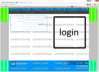
Foreground Graphics
There are a few foreground graphics that you can customize:
WIth the exception of the appIcon all of these are currently defined as png files.
- appIcon.ico
- where: browser tab
- recommended size: icon
- appLogo
- where: footer
- recommended size: 64 px x 64 px or larger
- companyLogo
- where: footer
- recommended size: 50 px high
- header
- where: header
- recommended size: 1100 px x 50 px
- login
- where: login page
- recommended size: 450px wide
Customizable Texts
All placeholders are optional.
Header
- Window/tab name
- Default: Flow for Chameleon | {0}
- The placeholder text {0} is replaced by the open module name Example: Flow for Super Ticker | Dashboard
- Default: Flow for Chameleon | {0}
- Image tooltip
- Default: Chameleon by Bannister Lake
Footer
- Company Url
- Default: http://www.bannisterlake.com
- Support Url
- Default: http://support.bannisterlake.com
- Version
- Default: BL Flow {FlowVersion} for Super Ticker {AdditionalFlowDescription}
- the placeholder text {FlowVersion} is replaced by the version number of Flow that is currently installed
- the placeholder text {AdditionalFlowDescription} is replace by login details such as the logged in user's content group and login name and role
- Default: BL Flow {FlowVersion} for Super Ticker {AdditionalFlowDescription}
- AppLogo tooltip
- Default: BL Flow | Content Management for Bannister Lake Broadcast Graphics Solutions
Background Graphics
There are a number of background graphics that you can customize.
Currently all of these images are defined as jpg files. It is possible to further customize the theme to allow them to be png as well. Please contact us for assistance with this.
- content_body
- this appears in the main column of content
- it is allowed to repeat on both x and y axis
- recommended to use light colors
- content_footer
- this appears below the content in the footer
- it is allowed to repeat on both the x and y axis
- content_header
- this appears above the content and navigation zone in the header
- it is allowed to repeat on both the x and y axis
- content_navigation
- this appears between the content header and body
- it is allowed to repeat on both the x and y axis
- footer
- this appears in the footer
- will be covered by the content_footer in the region below the content
- it is allowed to repeat on only the x axis
- this appears in the footer
- top
- this appears at the top/header
- will be covered by the content_header and content_navigation in the region above the content
- it is allowed to repeat only on the x axis
- this appears at the top/header
Samples
Help
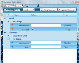
The main form and the dynamic field editor. Notice how the top graphic displays across the very top of the editor.
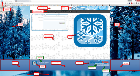
Snow Day
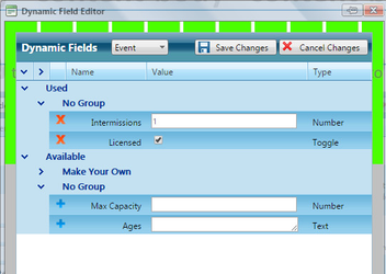
The main form and the dynamic field editor. Notice how the top graphic displays across the top and sides of the editor because it is tall enough to appear all the way down.
Also note that the "top" image is both wide and tall so you see unique content on both sides and all the way down to the bottom.